A clear direction for the future of Banqup
Change is an inevitable part of evolution. Over the past few months, our team has been working quietly behind the scenes to map out the next chapter of Banqup. Today, you will begin to see the first results of that work reflected in our platform and across our channels.
We are evolving our visual identity.
While our core logo and our signature blue remain the foundation of who we are, we have introduced a new visual language. But before we explain what the new colours and assets mean, we want to address something more important: why we are doing this now, and what it means for you.
Listening closely, acknowledging the gaps
A brand is not just a logo, a font, or a colour palette. A brand is a promise of service, reliability, and ease of use.
We know that recently, your experience with our platform hasn't always lived up to that promise. We have read your reviews, monitored your support tickets, and listened closely to your frustrations regarding platform speed, stability, and customer support.
We are not introducing this new look to celebrate or to gloss over these challenges. We are introducing it as a turning point. For everyone on the Banqup team, this visual evolution represents a renewed, concrete commitment to doing better.
The meaning behind the design
Every new element we have introduced has been chosen to bring clarity to your day-to-day business administration.
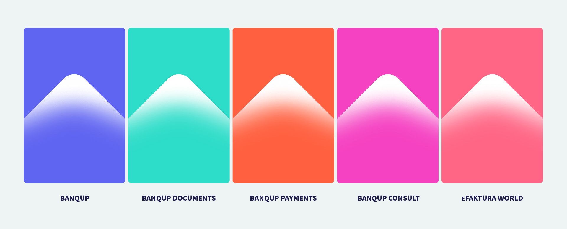
To make our platform more intuitive, we have introduced distinct, functional colours for the four pillars of our ecosystem. This colour-coding is designed to help you scan, click, and manage your tasks faster:
Banqup Documents - e-invoicing & e-trust (green): Grounded in calm simplicity, security, and compliance.
Banqup Payments - e-payments & e-trust (orange): Built around simplicity, speed, and confidence.
Banqup Consult (fuchsia): Representing modern accessibility and customer-centricity.
eFaktura World (pink): A space for clear financial reflection and data insight.
The upward arrow: our benchmark
Across our new website and communication, you will notice a recurring metaphor: an upward arrow drawn from the visual language of our logo.
In business, an upward arrow symbolises financial growth and positive momentum. But for our internal team, this arrow is a daily benchmark. It is a visual reminder of the direction we need to take our customer experience. It means moving our response times down and our platform stability up.
Outer change, inner focus
You will see these design changes roll out gradually. In our new photography, you will see portraits of diverse, real-world entrepreneurs looking upward toward the future, captured in natural, optimistic sunlight. That is the future we want to help you build.
But we know that beautiful visuals cannot replace a smooth customer experience.
While our design team has finalised the outside look, our development and support teams are entirely focused on the inside. We are prioritising system performance, refining our workflows, and investing in human connection to ensure that Banqup becomes the seamless, reliable partner your business deserves.
Thank you for your continued feedback and your patience as we work to earn your trust, step by step.